echart实现timeline+map+graph组合可视化图表

是这学期前端课(数据可视化)的一部分图表,实现了每月疫情地图+每月微博热点复合展示,用timeline组件动态播放每个月的数据。

这个组队的project拿了课程的二等奖,也帮助我以百分制里99分的成绩拿到了满绩,还是比较快乐的,于是来记录一下。

效果展示


废话不多说先上效果:

gif

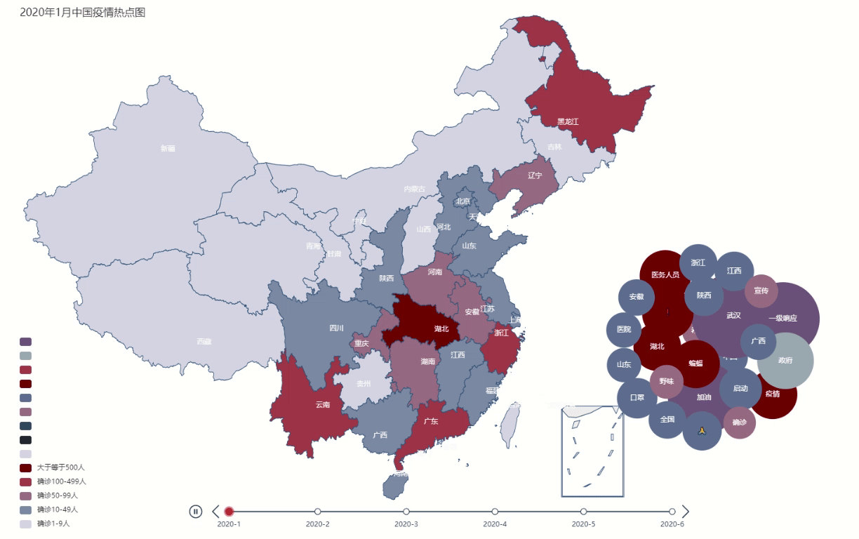
左半部分是每月现存疫情确诊数,右边是相对应的每月热点信息,气泡大小表示热度的高低,可以展示疫情情况对当月社会热点的影响。timeline组件动态显示每月的情况,2000毫秒变换一次月份。

前期准备


图表

主要使用的是百度echart团队的作品修改而来,网址:

https://echarts.apache.org/examples/en/index.html

基本上各种echart组件都有,对于我这种需要几天速成一个project

  • map

  • timeline

  • graph

    本来一开始使用wordcloud来展示每月热点,但是发现echart3已经不支持wordcloud了。在网上查了些导入wordcloud的资料,试了俩小时没有成功导入。后续想到使用graph展示热点信息,效果也不错。

数据

数据一部分是自己从微博上爬虫得来的(热点信息),一部分是在github上仓库里找到的(疫情地图数据)。

提供几个我用到的GitHub仓库:

【全国状肺炎疫情每日数据动态】https://github.com/JackieZheng/2019-nCoV

【2019新型冠状病毒疫情实时爬虫】https://github.com/BlankerL/DXY-COVID-19-Crawler

关键部分的代码


使用timeline的options属性来实现动态和组合。

1
2
3
4
5
6
7
8
9
10
11
12
13
14
15
16
17
18
19
20
21
22
23
24
25
26
27
28
29
30
31
32
33
34
35
36
37
38
39
40
41
42
43
44
45
46
47
48
49
50
51
52
53
54
55
56
57
58
59
60
61
62
63
64
65
66
67
68
69
70
71
72
73
74
75
76
77
78
79
80
81
82
83
84
85
86
87
88
89
90
91
92
93
94
95
96
97
98
99
options:[
{
title: {
text: 'January, 2020',
itemGap: 10,
textStyle: {
fontFamily: '\"Merriweather\"',
fontWeight: 'bold',
fontSize: 35
},
left: 'left'
},
series: [
{data: data1},
{data:hot1}
]
},
{
title: {
text: 'February, 2020',
itemGap: 10,
textStyle: {
fontFamily: '\"Merriweather\"',
fontWeight: 'bold',
fontSize: 35
},
left: 'left'
},
series: [
{data: data2},
{data:hot2}
]
},
{
title: {
text: 'March, 2020',
itemGap: 10,
textStyle: {
fontFamily: '\"Merriweather\"',
fontWeight: 'bold',
fontSize: 35
},
left: 'left'
},
series: [
{data: data3},
{data:hot3}
]
},
{
title: {
text: 'April, 2020',
itemGap: 10,
textStyle: {
fontFamily: '\"Merriweather\"',
fontWeight: 'bold',
fontSize: 35
},
left: 'left'
},
series: [
{data: data4},
{data:hot4}
]
},
{
title: {
text: 'May, 2020',
itemGap: 10,
textStyle: {
fontFamily: '\"Merriweather\"',
fontWeight: 'bold',
fontSize: 35
},
left: 'left'
},
series: [
{data: data5},
{data:hot5}
]
},
{
title: {
text: 'June, 2020',
itemGap: 10,
textStyle: {
fontFamily: '\"Merriweather\"',
fontWeight: 'bold',
fontSize: 35
},
left: 'left'
},
series: [
{data: data6},
{data:hot6}
]
},

]

通过上述代码就可以实现组件的组合,但是为了美观还需要指定每个组件的位置。

map图表位置和大小的显示样式:

1
2
layoutCenter: ['45%', '50%'],//距离左右,上下距离的百分比
layoutSize:'115%',//map百分比大小

graph的图表位置显示样式:

1
2
3
top: '25%',             // 图表距离容器顶部的距离
// right:'100%',
left:'70%',